I love LOTS of what Effy Wild creates. I joined her first for her Life Book Seekrit Clubhouse and then won her Book of Days semi-annual class (sooo lucky right?). The thing is, once you've done a class with Effy you're part of her community alumni and she offers discounts to subsequent classes....which is why I also joined Facing Forward II : the things we need to hear.
It was such a good deal - I love faces and want to explore more with Effy - I enjoy her honesty and her belief that creative practice can change your world. I really wanted to do these in order, so although I'm "behind", I'm happy that I've done my first face. Because my pages are in an old art book, I already had some text in the background. Decided to completely fill the gaps with lovely tissue paper by Tim Holtz, making sure I positioned the butterfly so it would become part of her head decoration.
As I applied the layers, I loved that the text and tissue marks continued to show through in the background.
I hadn't used an aquamarker before for face shading. I applied some of my recent learning about Zinc white vs Titanium white. Titanium white is known for being a bright white - excellent opacity and high strength for tinting to pastel. Zinc white is very transparent so while it will lighten a colour, it doesn't immediately change it to a pastel. Because Zinc white is more transparent, it is excellent for blending skin tones. I forgot to take photos in process because I was loving her so much, but here's a preview of her completed face after much more blending and layers.
Before I got to that point I colour blocked the other areas - all with metallics gives her a lovely glow
I love using stencils and used them to full effect in this piece. First for her wings and dress
Her halo
I used metallic pen in her hair and brushed over the butterfly with gold iridescent paint
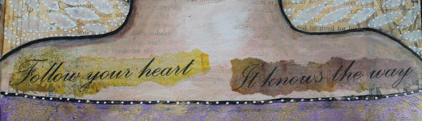
And finally she needed some words. I decided to use one of my favourite quotes and put it in a word document using a lovely font and size. Then I put it at 100% view on my screen and took the piece of inky newsprint that I wanted it printed on to check the position that it would print.
Make sure that you use a carrier page if your paper is thin. Then I tore the words and applied with gel medium.
The wee heart stamp on her face was the final touch.
I love that I've interpreted her in my own way - the original is the Cover face showing in the class advertising at the top of the page.
Reading through this post I see I have used that word "love" a lot! But I'm not changing it, cos I did love every minute of this lesson. Click on any photo to see it larger. I have created a flickr album so you can see the results of my lessons for all my Book of Days and Facing Forward II classes with Effy HERE.


Great to hear about your process. I'm in FFII also for the first time and really enjoying it. I like the metallics and realized I have some reinkers that would do well with this too. Thanks for the tip.
ReplyDeleteWow, I love this! I think you have really turned a corner as an artist! I knew that zinc white is more transparent, but I didn't quite make the connection with regard to the skin tone. Must try! Love how you incorporated the butterfly from the tissue paper and made it iridescent. I also find discount codes hard to resist! :)
ReplyDeleteThanks Zsuzsa - I feel like I have as well. Just want to do more and more faces 😊
ReplyDeleteThere is something about Effy's work that I love but find it very easy to make 'my own'.
Thanks Kathy - it's a fabulous course isn't it?
ReplyDeleteSo much to enjoy and be inspired by
Love is a great word to use a lot . . . so good to hear you're loving it Lynette!
ReplyDelete