Information about the FREE weekly Dcoumented Life Project is HERE. We're half way through the year! Here's our first 6 months of challenges :
and here's what 26 weekly challenges look like in the front of my journal
Each background to the challenge information is a bit of how I started each page.
This week's challenge :
For this week, the quote "A picture is worth a thousand words" made me decide to focus on a photo for each of my daily journal spots. This made the spread set-up quite different from my usual. I started with lovely Dylusions sprays and stencil
I sprayed on the left hand page (stencil still in place here) and then folded the right hand page over and pressed to take the print off the stencil. Here's the spread with the stencil removed and pages dry :
My usual habit is to do the spread, and rule off a daily journaling space on one side. Usually this includes photos on at least some of the days -
I liked Lorraine Bell's take on this week's challenge. She did image transfers of printed photos onto watercolour paper, and they are the main feature of the spread. Here I am trying out how the space might look if I had 7 photos - one for each day of the week.
Then I realised that there were 4 days left of June, and 3 for July this week, so I rearranged my pieces of paper and added the months and some initial doodles - the challenge is "photos and words" so that fits nicely.
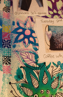
Next challenge - to have a photo a day. Some days it's easy - had coffee with Wendy from Late Start Studio and she gifted me one of her beautiful handmade kete. Feel very blessed with that. Other days I had to be a bit more creative and I decided to capture some of my currrent routine - it will be fun to look back on this in years to come (the basketball practice which we have early Tuesday mornings). I liked the idea of image transfers, but didn't have the time/energy this week for that, so decided to take an easier option which was to print the photos directly onto watercolour paper through my home printer.
I like the texture of the watercolour paper. I tore them apart, dated and wrote on them, then glued them on the page. The sizes and shapes are much less regular than my initial squares and I like that a lot better. This also gave me more room for adding tape and more doodles between
And here is this week's spread all done
Click on the photo to enjoy it larger or see it in the Flickr album I've created for all my Documented Life 2015 spreads HERE. You can see all my posts about this project HERE. Can't wait to see what our new theme for July will be...


