Showing posts with label Embossing. Show all posts

Wednesday, December 9, 2015

Christmas Cards

It's fun to make cards for special occasions. This was a get well card I don't think I've shared.
Now it's approaching Christmas and time to make my cards as I have for the last few years. Often I'll use stencils for this process : 
This year I have every intention of making another major batch, but for now, I have just made about 10 cards for some immediate giving, and more will follow once I finish work on Friday. I started with some gelli-printed papers from a recent session. 
Thought purple would be lovely with gold for Christmas. Tore these sheets up and applied to cardstock (sorry no step-by-step photos), then added a lovely tree stamp which I embossed, before adding a few touches of gold stamping, christmas washi tape, and purple stitch to finish. This was the first prototype
And then I went on to create variations
(click on the photo to see them larger)
Starting to feel festive and looking forward to finding out what will inspire me for the next batch.
Hope you are finding time to create something that makes you happy.

Sunday, April 26, 2015

Week 17 : DLP 2015

Information about the FREE Documented Life Project is HERE. Since April's theme was revealed 
I've been waiting for this week's challenge
It's no secret that I love using sprays. This post will be the 79th that has Spray as a label! I have a variety of sprays in my stash, and particularly love the vibrancy of the Dylusions sprays which I used in my Dylusions journal for the base of week 3's challenge :
In the Dylusions journal they don't bleed through to other pages and they blend beautifully.
I wanted this week's spread to honour our ANZAC100 year anniversary so that was my starting point.
I decided that I would like to have poppies on my page and have a lovely stencil by Donna Downey. If you want to have a design embossed and you don't have the right colour embossing powder, you can use Ranger Distress Ink pads and then a layer of clear embossing powder. I thought it would be cool to have embossed poppies and then sprays in the background, but I wanted to be sure this would work as a resist technique so tested it first on a manila tag :
The embossing adds lovely dimension and shine as seen in the photo below
and it was really good to do a test first because you can see on the top poppies I didn't quite sprinkle enough embossing powder so will be more careful on the actual page. Also able to experiment with adding black pen detailing. So into the actual journal :
I used distress ink pads in fired brick and peeled paint, applied through the stencil with a cosmetic sponge. I turned the stencil over sometimes so they look more random. I applied the inks a section at a time and then did the clear embossing powder and heated that before moving on to inking another section so the ink was still wet to capture the powder.
Then I sprayed dylusions inks - London Blue over lace, and Dirty Martini, Cut Grass and Fresh Lime randomly behind the poppies. 
I wanted to use the black leaf washi tape because I knew I would add some black paint to my spread. I wanted to keep it fairly simple so sponged black heavy body acrylic paint within a silhouette shape - the poppies even resisted that paint. Really happy with the effect :
Then I added 100 for the anniversary, and the written phrase. Just a few lines of black pen at the base of the poppy heads and I called it done.
So I completely ignored the art prompt this week, but used 2 kinds of ink effects and am really happy with how my spread turned out. Click on the photo to enjoy it larger or see it in the Flickr album I've created for all my Documented Life 2015 spreads HERE. You can see all my posts about this project HERE.

Wednesday, April 15, 2015

Week 15 : DLP 2015

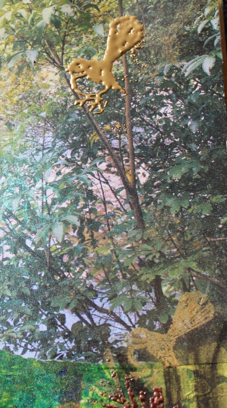
It is school holidays in New Zealand, and last week the weather was still lovely for bush walks. On Easter Monday we did the Sledge Track with my brother's family. It was an easy walk alongside the river being escorted by fantails, hearing the call of tuis, lovely dappled light, and the view and sound of water tumbling alongside. 
Information about the FREE Documented Life Project is HERE. This weeks challenge : 
I'm not interested in crying a river, but I wanted to celebrate our river walk. I decided to try something different for my page this time, and started by gathering some previously gelli printed papers in bush-like greens/themed.
I then printed my photo (at the top of this post) on my canon printer onto a piece of A4 photo paper, so it was larger than normal photo size. I cut it in half and glued it to my spread thinking I could use that to inspire the rest. I tore various pieces of gelli printed papers and added them with gel medium. Then I covered the whole with clear gesso to ensure I had the same surface for consequent layers and I wasn't sure if the ink on the photo would run if I added wet media without a protective layer. I'm happy to see the sections of the photo are already blending harmoniously with the papers
I like the printed piece on the left that will become my journaling spot because it's not too dark and has a variety of pattern. I am absolutely in love with how that purple swirly piece makes me think of the water swirling over rocks. My next step was to add lighter greens in acrylic paint, with additions through stencils that suggested rocks in the lower right and dappled light along the top
Click on any photo to enjoy it larger
Then I was thinking about how to add more light and decided that stamping with perfect medium and apply some perfect pearls would be nice - I was right
This naturally led to me using the same stamp but with embossing powder this time for a different texture/look. The darker bronze is utee ultra-thick embossing powder
I have an old book of the "Famous Five" that has lovely old thick paper and good words. I roughly tore words to capture the event and once glued down, outlined it with a black marks-all stabilo pencil which makes a lovely grungy line when activated with a water brush
I had also used the stabilo pencil to make some tree trunks  before I did the embossing:
I really enjoy applying acrylic paint with a cosmetic sponge through drywall tape - it gives a lovely subtle effect so I did that next for adding the sense of more different light and shadow
I just needed to add a little more movement and blue to the water
and can't forget the fantails!
I feel really happy with my spread. I have captured the essence of that lovely morning walk - the feeling of the light and peacefulness. 
Hope you enjoyed seeing how other media can complement acrylic paints, and how you might include your gelli prints in your art. You can see all my posts about this project HERE and I've created a Flickr album for all my Documented Life 2015 spreads HERE.

Sunday, January 11, 2015

LB 2015 : Beacon of Light

So excited to have finished the first full lesson from Life Book 2015. I needed to warm up a bit before I launched into this and made my Tag from Life Book week 2 first which I shared HERE.
Week 1's main lesson was to create a beautiful whimsy character to be our "Beacon of Light", guiding and supporting me through the year.
I have never drawn a face before, and am just amazed at what I've done here with Tam's absolutely superb video instructions. Here are the progress photos - click on any to see them larger
Tam's figure was done with a yellow/gold monochromatic colour scheme - I shared her sample in my post HERE. Although I want to follow the lessons closely to learn as much as I can, those colours just weren't me, so from this point mine looks quite different from hers. My girl's face is tanned from our lovely NZ summer. I have created a background that references sand and sunshine at the beach, and a bit later I added some additional stamping and embossing with distress powder that adds to the sandy feel
I used metallic paint for her hair, and the rest of her is paua colours. Took these shots in the sunshine so you can see the shimmer
Adding glitter was a fun  step
Butterflies appear regularly in my work. I decorated the dress with a butterfly from a serviette, and I stamped my word on another piece of tissue before gluing that too. The dress has a background of torn sheet music since music is always playing in the background of my life. The little purple heart is a brad.
The character holds symbols that are meaningful to us. Tam's were drawn on. I want to try and include stitch in all my projects this year. I machine stitched down from her hands and left ends of thread to tie some charms on. They are fairly flat so if I want to bind them into a book at the end of the year they are not too dimensional.
The heart symbolises how I always approach my art, and the other charm says stitch. I also machine stitched around the edge when finished...I stitched it unevenly on purpose ;-) 
Love that I've learned so much from following the lesson steps but made my beacon of light my own. I am VERY ready for the next lesson, and she stands on my desk to watch what happens next

Sunday, August 3, 2014

Me Time Messages 3

Over at the blog of Miscanthus Crafts you'll find free instructions for creating envelopes with messages that you personalise. There's going to be 6 week's worth in all, and I thought you might like to see how the demo envelopes differ from my own
Cover :
By Clare Lloyd of Miscanthus Crafts
by me
Envelope 1 : 
by Clare Lloyd
And here's both sides of mine :
I am always fascinated to see how the same instructions can produce such different results! Envelope 2 by Clare Lloyd :
Envelope 2 by me :
Now it's time to share my envelope #3 - instructions HERE
Started with another coloured envelope - a smaller one this time. Ignored the step of applying gesso so I could keep my pink background, and moved to the instruction of applying ink through a stencil - I used a sponge and an ink pad. Loved the effect on the first side
and decided to go for a different and more subtle colour variation on the other side - also loving this
Next step to apply some stamping and embossing
Used Tim Holtz Distress Embossing Powders. This yellow colour is Antique Linen and the greyed blue below is Weathered Wood.
This is the same flower stamp I used for Envelope 2. Here the upper flower was indistinct...and I'm not sure about that colour choice. My solution is usually to add more! Used one of my own hand-carved stamps to add embossed feathers
Click on any photo to see the details larger
Liked this much better, so went ahead and added more embossing to the other side
Feeling lots happier. Next instruction was to add some shine and texture - although these embossing powders are not as glitzy as others, they add lots of texture and some glimmer. I decided to add extra shine and texture by stitching around the envelope with metallic thread
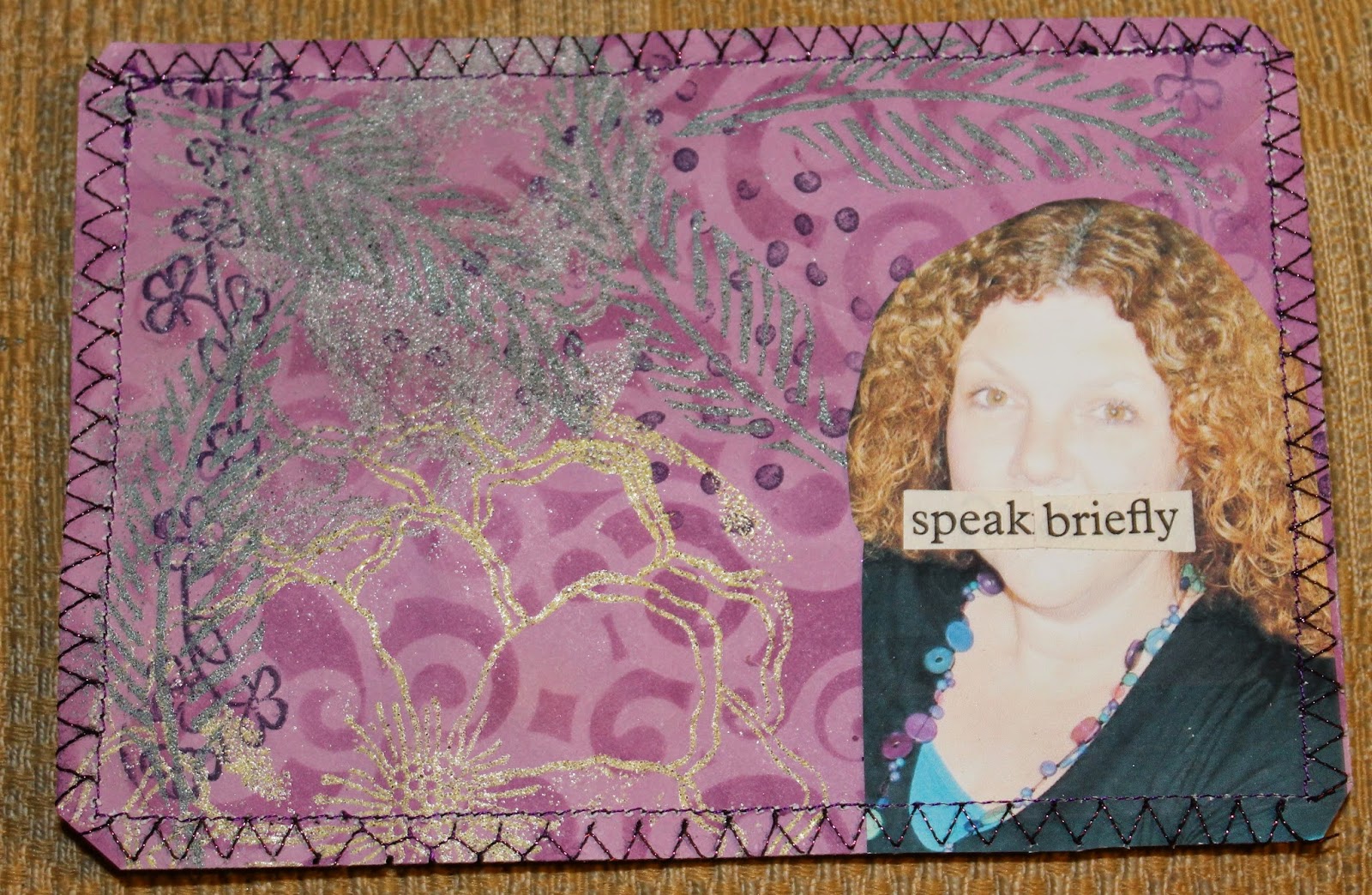
Now time to add words and images. My subject for this envelope was to be careful of what I say - sometimes I say too much...with the boys I'm still trying to learn that keeping it brief is most effective. I also need to pick my times to say things - because I'm always ready to receive communications I forget that when they're immersed in something we need them to do, it's not the right time to introduce another subject!
Kept my words on the envelopes to a minimum as well ;-)
Half way through the project
Let me know if you're playing along too - see all my postings from this workshop HERE
Related Posts Plugin for WordPress, Blogger...