Wednesday, August 6, 2014

Butterfly Stitching

When we went on our South Island holiday, I had a lovely visit to Broomfields' store in Christchurch. They have a huge selection of needlework and tapestry supplies
It is a gorgeous shop to wander in if you love stitching and I could have spent a lot of money there but, still being Thrifty, I limited myself to a lovely piece of seafoam coloured linen and a card of variegated thread.
Click on the photo so you can see the linen better :-)
I've recently picked them up and am using this pattern as the base of my own butterfly stitchery
Mine will be less formal than the original pattern. This is my first butterfly
The pink thread is the tacking line I have marked to define the edge of my stitching so that I can mount this on canvas when done.

Sunday, August 3, 2014

Me Time Messages 3

Over at the blog of Miscanthus Crafts you'll find free instructions for creating envelopes with messages that you personalise. There's going to be 6 week's worth in all, and I thought you might like to see how the demo envelopes differ from my own
Cover :
By Clare Lloyd of Miscanthus Crafts
by me
Envelope 1 : 
by Clare Lloyd
And here's both sides of mine :
I am always fascinated to see how the same instructions can produce such different results! Envelope 2 by Clare Lloyd :
Envelope 2 by me :
Now it's time to share my envelope #3 - instructions HERE
Started with another coloured envelope - a smaller one this time. Ignored the step of applying gesso so I could keep my pink background, and moved to the instruction of applying ink through a stencil - I used a sponge and an ink pad. Loved the effect on the first side
and decided to go for a different and more subtle colour variation on the other side - also loving this
Next step to apply some stamping and embossing
Used Tim Holtz Distress Embossing Powders. This yellow colour is Antique Linen and the greyed blue below is Weathered Wood.
This is the same flower stamp I used for Envelope 2. Here the upper flower was indistinct...and I'm not sure about that colour choice. My solution is usually to add more! Used one of my own hand-carved stamps to add embossed feathers
Click on any photo to see the details larger
Liked this much better, so went ahead and added more embossing to the other side
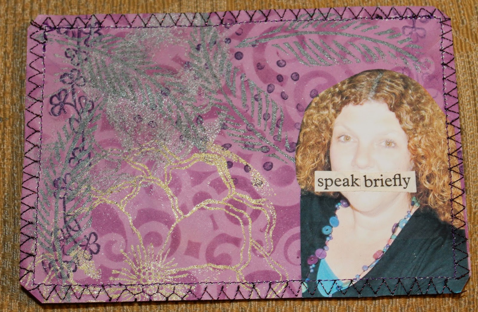
Feeling lots happier. Next instruction was to add some shine and texture - although these embossing powders are not as glitzy as others, they add lots of texture and some glimmer. I decided to add extra shine and texture by stitching around the envelope with metallic thread
Now time to add words and images. My subject for this envelope was to be careful of what I say - sometimes I say too much...with the boys I'm still trying to learn that keeping it brief is most effective. I also need to pick my times to say things - because I'm always ready to receive communications I forget that when they're immersed in something we need them to do, it's not the right time to introduce another subject!
Kept my words on the envelopes to a minimum as well ;-)
Half way through the project
Let me know if you're playing along too - see all my postings from this workshop HERE

Friday, August 1, 2014

Watercolour Calendar Journaling

I LOVE colour - my next couple of calendar spreads show this to optimum effect! I got a new brilliant koh-i-noor watercolour stack with an arty voucher for my birthday 
These samples show my original Koh-I-Noor stack colours on the left, and the new brilliant ones on the right!
I started with sprayed colour over lace again, and then went in and lay down my new watercolours - you can see if you read the page that I got them on the Thurs.
click on any photo to see it larger
As you can see, I am regularly including photos of what I'm reading, what I'm watching, and stages of projects I'm creating. I like having these photos of my banner in progress - at this stage I wasn't blogging so felt I had to capture this somewhere else, but I hope to continue these progress photos in my journal.
You can see more headings inspired by my lettering book 
and as I continued with the second page, you can see the colour continue. I had a weekend where I had a chance to catch up on some DVD watching, and also to spend some time going through old blogposts of Alisa Burke
So inspired by her that I included the flip out so I could remember how I spent a day when I still wasn't feeling that well, but filled up on creative ideas :-)
You can see all my calendar journal pages in my flickr set HERE.
Related Posts Plugin for WordPress, Blogger...