I love LOTS of what Effy Wild creates. I joined her first for her Life Book Seekrit Clubhouse and then won her Book of Days semi-annual class (sooo lucky right?). The thing is, once you've done a class with Effy you're part of her community alumni and she offers discounts to subsequent classes....which is why I also joined Facing Forward II : the things we need to hear.
It was such a good deal - I love faces and want to explore more with Effy - I enjoy her honesty and her belief that creative practice can change your world. I really wanted to do these in order, so although I'm "behind", I'm happy that I've done my first face. Because my pages are in an old art book, I already had some text in the background. Decided to completely fill the gaps with lovely tissue paper by Tim Holtz, making sure I positioned the butterfly so it would become part of her head decoration.
As I applied the layers, I loved that the text and tissue marks continued to show through in the background.
I hadn't used an aquamarker before for face shading. I applied some of my recent learning about Zinc white vs Titanium white. Titanium white is known for being a bright white - excellent opacity and high strength for tinting to pastel. Zinc white is very transparent so while it will lighten a colour, it doesn't immediately change it to a pastel. Because Zinc white is more transparent, it is excellent for blending skin tones. I forgot to take photos in process because I was loving her so much, but here's a preview of her completed face after much more blending and layers.
Before I got to that point I colour blocked the other areas - all with metallics gives her a lovely glow
I love using stencils and used them to full effect in this piece. First for her wings and dress
Her halo
I used metallic pen in her hair and brushed over the butterfly with gold iridescent paint
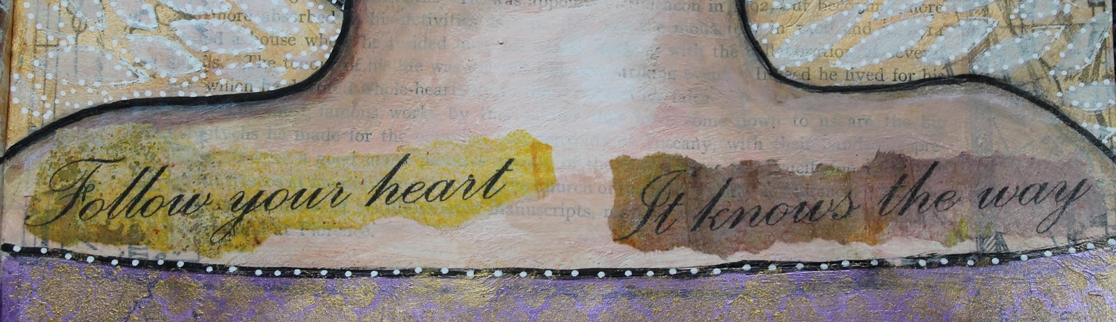
And finally she needed some words. I decided to use one of my favourite quotes and put it in a word document using a lovely font and size. Then I put it at 100% view on my screen and took the piece of inky newsprint that I wanted it printed on to check the position that it would print.
Make sure that you use a carrier page if your paper is thin. Then I tore the words and applied with gel medium.
The wee heart stamp on her face was the final touch.
I love that I've interpreted her in my own way - the original is the Cover face showing in the class advertising at the top of the page.
Reading through this post I see I have used that word "love" a lot! But I'm not changing it, cos I did love every minute of this lesson. Click on any photo to see it larger. I have created a flickr album so you can see the results of my lessons for all my Book of Days and Facing Forward II classes with Effy HERE.